Publicis Sapient | Nissan

Nissan & Mazda UX Analysis: Driving Digital Optimisation

Driving Digital Excellence:
A UX Design Case Study on Nissan.co.uk vs. Mazda.co.uk

You are here:

Listen to the Case Study Overview:

Discover how Nissan sought to revitalize its digital presence and enhance user experience on Nissan.co.uk, addressing declines in customer satisfaction and sales rankings. This analysis reveals the challenges faced, such as an overcrowded homepage and a confusing car configurator, and how a user-centric design philosophy can drive engagement and conversion rates


Learn More

  • Understand the Design Thinking approach that incorporated Voice of Customer (VOC) analysis and quantitative user behavior data.
  • Explore the key findings on UX design issues and the comparison with Mazda.co.uk's more streamlined online experience.
  • See the recommended solutions for enhancing customer satisfaction, regaining competitive advantage, and building brand trust through digital optimization.

Executive Summary

This project was born from a critical need: Nissan’s digital presence was not just stalling, it was slipping. The New Car Buyer Study (NCBS) FY24 report highlighted concerning declines in Nissan.co.uk’s rankings across its primary digital touchpoints—the main website, the interactive car configurator, and the e-commerce platform. This wasn’t merely a statistical dip; it signaled a direct impact on customer satisfaction, brand perception, and ultimately, sales.

Unlocking Digital Performance Through Real User Experiences

My extensive UX design analysis, grounded in a robust Design Thinking approach, aimed to dissect the intricacies of Nissan’s online experience. The goal was clear: pinpoint the specific friction points causing user frustration, understand the reasons behind surprisingly low engagement, and address the pervasive technical errors that were making the entire customer journey a frustrating endeavour. In stark contrast, Mazda.co.uk consistently demonstrated a more intuitive, streamlined, and friction-reducing online experience.

This study serves as a compelling narrative about how a deep understanding of user behaviour and a meticulous comparative analysis can not only diagnose digital ailments but also pave the way for a resurgence in customer satisfaction, enhanced conversion rates, and a stronger competitive position in the market.

The Challenge: Navigating a Labyrinth of User Friction

Nissan.co.uk, despite its robust technical underpinnings, faced a significant hurdle: a disconnect between its powerful backend and the actual user experience. The NCBS FY24 report laid bare the declining performance:

  • Website Ranking: Down 2 spots.

  • Configurator Ranking: A critical 4-spot decline.

  • eCommerce Ranking: Dropped 3 positions.

These declines directly impact online visibility, potentially leading to reduced website traffic and lost sales opportunities. Through detailed analysis, three core areas of friction emerged:

  1. Usability Roadblocks: Users struggled to find critical information, navigate complex interfaces, and utilise key functionalities.

  1. Engagement Deficits: Key interactive tools, particularly the configurator, saw alarmingly low user interaction, indicating a lack of intuitive design or technical barriers.

  1. Pervasive Technical Glitches: A high frequency of JavaScript errors across all platforms actively disrupted user journeys, leading to broken features and abandonment.

This scenario painted a picture of a digital experience that, while technically sound in some aspects, consistently presented a frustrating journey for its users.

Getting to Grips with What Users Really Face

My Approach

A Human-Centric, Data-Driven Investigation

To tackle these complex challenges, my methodology was built on a multi-faceted, iterative Design Thinking framework

My analysis wasn’t just a quick look; it was a carefully structured journey, following the core ideas of Design Thinking. By really stepping into our users’ shoes (the Empathise phase) and then clearly defining what needed fixing (the Define phase), I aimed to uncover not just what was wrong, but why

1. Discovery: Unearthing User Realities

1. Discovery: Unearthing User Realities

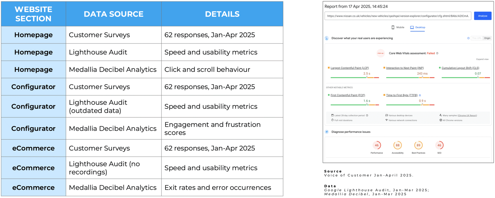
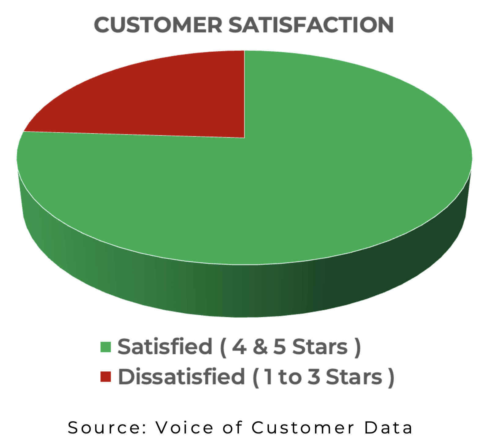
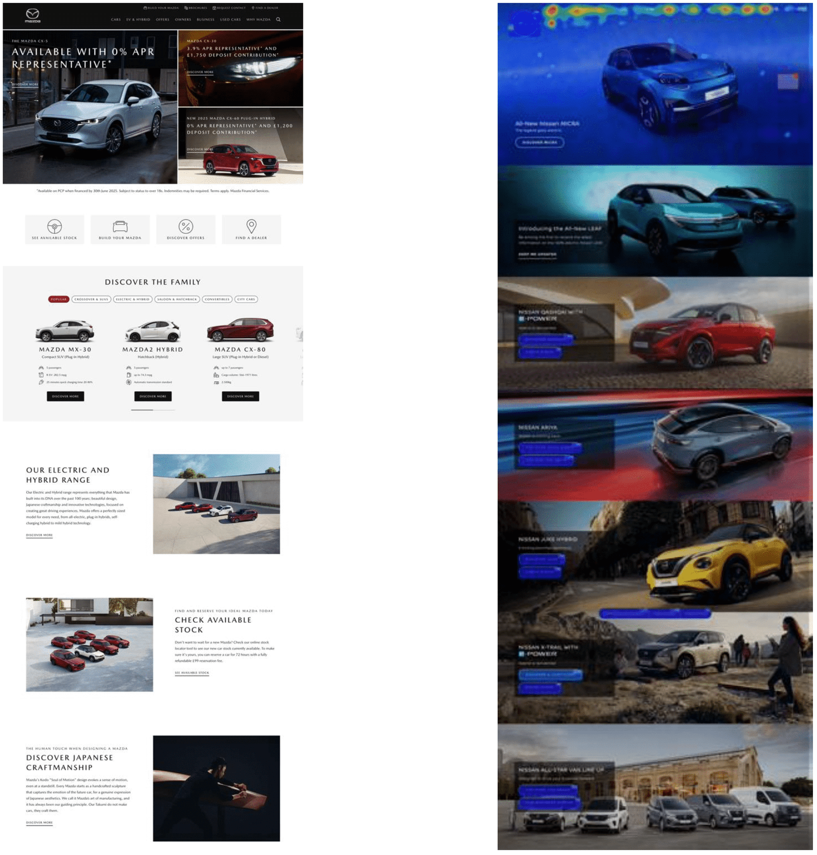
Voice of Customer (VOC) Analysis: I initiated a deep dive into qualitative customer feedback, analysing 62 responses collected from January to April 2025. This provided direct, unfiltered insights into user pain points across the Homepage, Configurator, and eCommerce sections. A significant finding was that 58% of this feedback originated from mobile users, immediately highlighting the critical need for mobile experience optimisation.

Quantitative User Behaviour (Medallia Decibel Analytics): Complementing VOC, I analysed Medallia Decibel data to understand what users were doing (click and scroll behaviour) and how they felt (engagement and frustration scores). This provided crucial quantitative backing to the qualitative feedback.

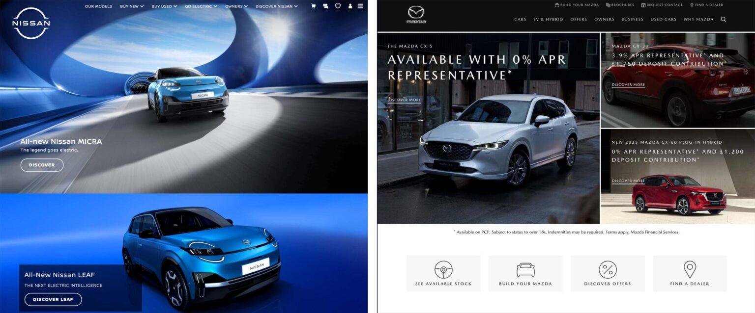
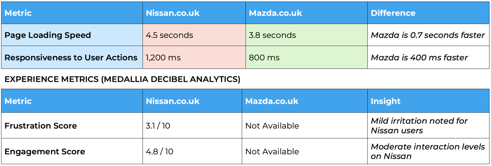
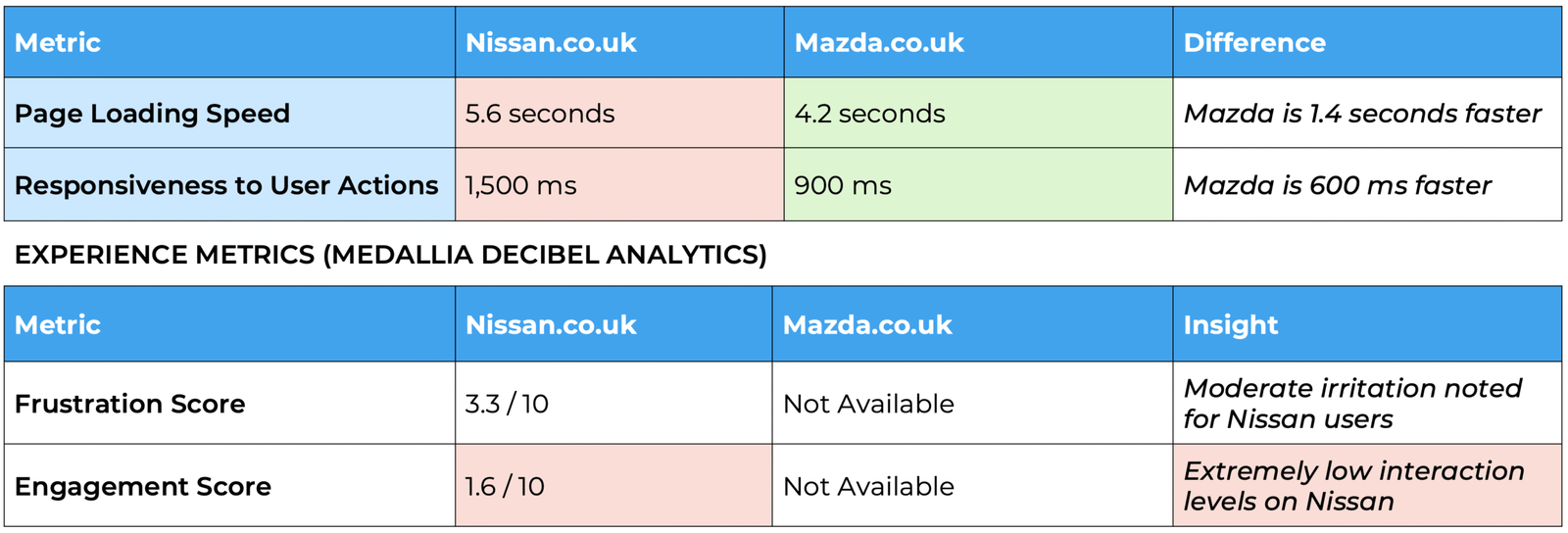
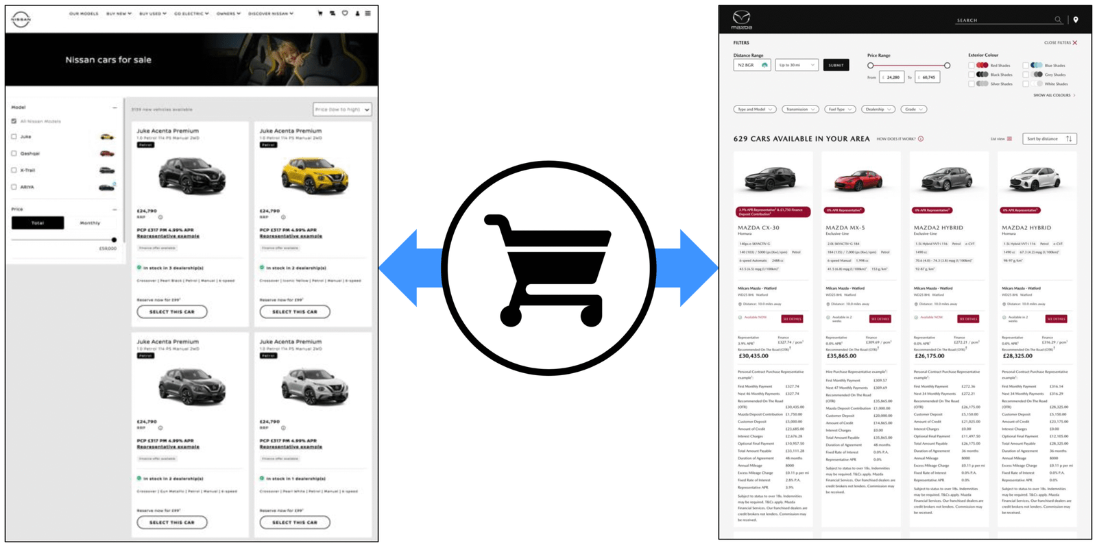
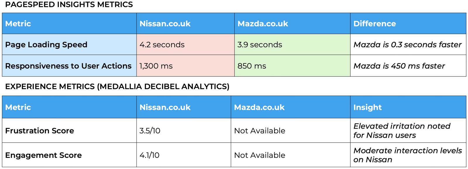
Performance Benchmarking (PageSpeed Insights): I leveraged PageSpeed Insights to gather objective technical performance metrics for both Nissan.co.uk and Mazda.co.uk, focusing on:

Page Loading Speed: Key metrics like Largest Contentful Paint (LCP) and First Contentful Paint (FCP).

Responsiveness: Interaction to Next Paint (INP), measuring how quickly the site responds to user input.

Visual Stability: Cumulative Layout Shift (CLS), indicating unwanted layout shifts during loading.

2. Analysis & Synthesis: Connecting the Dots

Comparative UX Audit: This was a cornerstone of the project. I conducted a meticulous side-by-side comparison of Nissan.co.uk and Mazda.co.uk’s design elements, user flows, and information architecture across the Homepage, Configurator, and E-commerce platforms. This audit, despite limitations in accessing Mazda’s internal data, allowed for the identification of clear best practices and specific areas where Nissan fell short.

Heatmap Analysis: Examining click and scroll heatmaps (for Nissan) helped visualise user attention and interaction patterns, revealing areas of high friction and missed content.

JavaScript Error Log Review: A detailed analysis of critical JavaScript errors was performed, quantifying their occurrences and pinpointing their impact on specific functionalities.

Key Findings

The Anatomy of a Frustrating Journey

My analysis revealed a consistent pattern of user struggle on Nissan.co.uk, characterised by an overburdened interface, critical information discoverability issues, and disruptive technical errors.

Homepage: Overcrowded and Overlooked

The Problem: Nissan’s homepage, intended as a primary entry point, was “populated with numerous visual elements and interactive calls-to-action,” leading to a visually “overcrowded interface.” Users frequently vocalised their frustration:

  • No interior images.” (VOC Feedback)

  • Finance calculator page not available!!” (VOC Feedback – it was there, just hidden).

  • Can’t find technical data or price.” (VOC Feedback)

  • Give prices, insulting viewers.” (VOC Feedback)

This directly translated into a mild frustration score of 3.1/10 on Medallia Decibel. Users exhibited “rapid scrolling behaviour,” often bypassing crucial content as a result of “visual overload.”

The Performance Gap:

Page Loading Speed: Nissan.co.uk: 4.5 seconds (compared to Mazda’s 3.8 seconds – Mazda is 0.7s faster).

Responsiveness: Nissan.co.uk: 1,200 ms (compared to Mazda’s 800 ms – Mazda is 400ms faster).

Impact: Mazda’s “streamlined interface with a prominent hero image” and “minimal calls-to-action” clearly enhanced content discoverability and minimised “cognitive overload,” directly impacting user satisfaction.

Car Configurator: A Maze of Missed Opportunities

The Problem: The configurator, a critical tool for customisation, was designed as a “single-page interface displaying all customisation options concurrently.” This dense layout was a significant barrier, leading to “extremely low user interaction” (an abysmal engagement score of 1.6/10) and “moderate user irritation” (frustration score of 3.3/10). User comments were stark:

  • “Difficult to navigate and select.” (VOC Feedback)

  • “Couldn’t navigate it at all!” (VOC Feedback)

  • “Not always the right information, prices on website and very glitchy.” (VOC Feedback)

This experience was particularly challenging for “older demographics (average age 61.5).” Moreover, thousands of critical JavaScript errors, specifically over 2,000 occurrences of “TypeError: undefined is not an object (evaluating ‘bounds.left’)”, actively rendered the tool “unusable.”

The Performance Gap:

  • Page Loading Speed: Nissan.co.uk: 5.6 seconds (compared to Mazda’s 4.2 seconds – Mazda is 1.4s faster).
  • Responsiveness: Nissan.co.uk: 1,500 ms (compared to Mazda’s 900 ms – Mazda is 600ms faster).
  • Impact: Mazda’s “multi-step interface with a progress indicator” effectively guided users “sequentially,” reducing cognitive load and enhancing clarity, resulting in a more seamless customisation journey.

E-commerce Platform: Errors Leading to Abandonment

The Problem: The final stage of the user journey, the e-commerce platform, exhibited the “highest across sections” user irritation, with an “elevated frustration score” of 3.5/10. This was directly linked to usability issues and technical flaws. User feedback highlighted the severity:

  • “Make it easier to navigate from smart phone.” (VOC Feedback)

  • “Got an error when trying to pay, almost gave up!” (VOC Feedback)

  • “Checkout process is confusing, too many steps.” (VOC Feedback)

These issues culminated in “significant drop-off… before purchase completion,” indicating a direct link between the problematic UX and user abandonment.

The Performance Gap:

  • Page Loading Speed: Nissan.co.uk: 4.2 seconds (compared to Mazda’s 3.9 seconds – Mazda is 0.3s faster).

  • Responsiveness: Nissan.co.uk: 1,300 ms (compared to Mazda’s 850 ms – Mazda is 450ms faster).

  • Impact: While both checkout designs were conceptually “similar and streamlined,” Nissan’s implementation was “error-prone,” suggesting that even minor frictions or technical glitches at this critical stage have a disproportionately high impact on conversion.

The Pervasive Threat: JavaScript Errors

A recurring and critical finding across all platforms was the widespread presence of JavaScript errors, acting as a silent saboteur of the user experience.

  • Homepage: 608 occurrences of “ReferenceError: Can’t find variable: gmo” disrupted core functionality.

  • Configurator: Over 2,000 occurrences of “TypeError: undefined is not an object (evaluating ‘bounds.left’)” directly rendered the tool unusable.

  • eCommerce: 284 occurrences of “ReferenceError: Can’t find variable: gmo” during checkout significantly risked user abandonment.

The Impact: These errors fundamentally increase page load times, break critical features, and degrade overall performance, directly diminishing customer satisfaction and hindering conversion rates. They erode user trust and create a perception of an unreliable digital platform.

Conclusion: The Path to Digital Leadership

This comprehensive UX design analysis underscores a clear path for Nissan to revitalise its digital presence. While the technical foundations are strong, the user experience currently presents significant friction points, low engagement, and critical reliability issues due to JavaScript errors.

1. Homepage & VLP Optimisation: Focus on Discoverability & Clarity

By embracing a more user-centric design philosophy—characterised by clarity, streamlined flows, and technical stability—Nissan can:

  • Elevate Customer Satisfaction: Directly address the frustrations voiced by users, transforming a “headache” into a seamless, enjoyable experience.

  • Drive Engagement & Conversion: Remove barriers that currently lead to abandonment, encouraging deeper interaction with key tools like the configurator and leading to a demonstrable increase in completed purchases.

  • Regain Competitive Advantage: By outperforming competitors like Mazda in digital usability, Nissan can recover its rankings in influential studies like the New Car Buyer Study (NCBS), enhancing online visibility and market share.

  • Build Brand Trust: A reliable, intuitive, and error-free online presence is fundamental to building lasting customer trust and loyalty in the digital age.

This study is more than just data; it’s a blueprint for action. By strategically investing in these UX improvements, Nissan has the opportunity to not only recover its digital footing but to truly lead the charge in delivering exceptional online automotive experiences, ultimately driving customer happiness and business success.